The Beauty of S-Log2
The first time I filmed with the S-Log2 picture profile was also the first time I used the SONY A7s mirrorless camera. That was in March of 2015 while filming a road trip adventure across the great state of Oregon. See the film here. Since then, I've shot maybe 100 films using an array of different Sony's (A7s, A7sii, FS7) and edited/graded countless S-Log2 clips. I don't make the claim to be a great colorist or technical expert. This blog post is simply meant to share my technical and creative approach to using Sony's impressive, and tricky, S-Log2 picture profile.
When it comes to effectively using the S-Log2 profile, I've found there are 4 keys elements: Lighting, exposure, composition and the color grade.
Quick note: When using the SONY A7sii I use Picture Profile 7 (PP7) under the camera settings. My settings are as follows: Black Level: 0, Gamma: S-Log2, Black Gamma: Middle/0, Knee: Auto, Color Mode: S-Gamut, Saturation: 0 and Color Phrase: 0.
Lighting
This part is simple, yet complex. You need high-quality light to make a beautiful image. Simple as that. But you also need to take into account how the lighting assists the story line. It's hard for me to specifically describe how to get high-quality light without knowing the details of the environment and what the story is trying to say. And that is the art. Is it a dramatic story? Is it a bright story? Is it a simple story? The lighting is obligated to be honest about what the story is trying to say and then push that story along. Below are some images I've pulled from Premiere projects to demonstrate the before and after comparisons of the S-Log2 color grade. And how the picture profile handles different lighting scenarios. I've included short write ups under each image about my motivation for the lighting and editing.
Exposure
During that time in March of 2015 a new concept was emerging in the digital camera space called ETTR. Or at least it was new to me. This concept was showing up more and more on S-Log2 forums and all other digital cinema blogs. ETTR stands for, "Expose to the right". For me, this was a new concept all together. From the time I can remember, underexposing images "just a touch" was the way to do it. Normal workflow was; underexpose by a stop or two, protect the highlights, then lift the image in post production. But that's not right. As I've come to learn, the modern digital sensor wants (and needs) as much light as possible- without overexposing highlights obviously.
When I'm working with the S-Log2 picture profile on my Sony A7sii I'm constantly analyzing the live histogram and making sure the image is slightly exposed to the right. Notice the histogram below.
Expose to the right without losing detail in highlights. (ETTR)
Composition
This section is not about the rules of composing an image. If you don't know those, click here. This section is about knowing what the strengths and weaknesses are for any particular codec or picture profile, and then composing the scene to give you ultimate flexibility in post. When composing an image I always consider how the subject is fitting into the scene. With most high-end camera systems, like the RED and Arri, their RAW codec is more flexibility in post which allows the dark and light outliers to be fixed more easily. So, when I know my camera's footage is more flexible in post, I can be more of a risk taker on set. But, when the codec is more compressed, like the SONY A7sii, you need to make decisions on set that will give you more success in post. In my opinion, the healthiest images exist when the histogram has a bell-curve shape (see below). So, often times, I'll adjust my scene, my composition and everything else I can, until my histogram has a bell-curve shape. Then I know that in post I'll have ultimate flexibility when it comes to coloring. Getting this shape can be very tricky and sometimes not even an option. But the more you practice it, the more natural you become at obtaining it. Hint: Know the Zone System. After I get the histogram close to bell-shape, I then adjust my ISO, f-stop and/or filter settings to ETTR.
Color Grade
I've found that starting with pre-made cinematic LUTs really helps me dial in the S-Log2 image. With Premiere's integrated color workspace, you can easily add a LUT over a clip, reduce the intensity of it, then start customizing the grade. Speed is the name of the game when editing video. The faster and more efficiently I can edit and color, the quicker I can move on to the next project. Time is money, eh? So, I bought an S-Log2 LUT package from Vision Color and use these to add over clips in Premiere. Most importantly, if you overexposure the image by 1 or 2 stops, then you should be able to pull down the RGB curve, and that should really bring the image to life (see post curve below). If you have to do the opposite, by lifting the curve in post, you may introduce some noise into the image. Which is fine, just make sure to use a noise reduction program like Neat video. My favorite LUT in this package is probably Vision 6 - LOG32.cube.
Before and After Color Grades
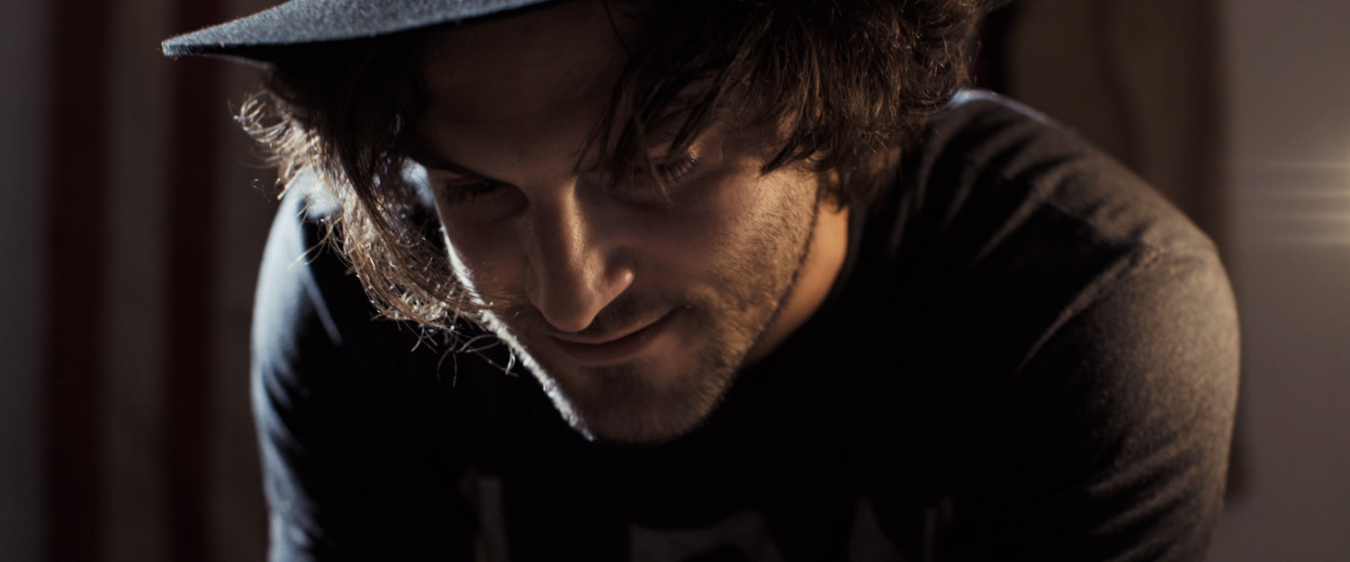
Lighting motivation: I killed all the overhead fluorescent house lights, and opened the garage to get an edge light. I used the spark's bouncing light as my fill.
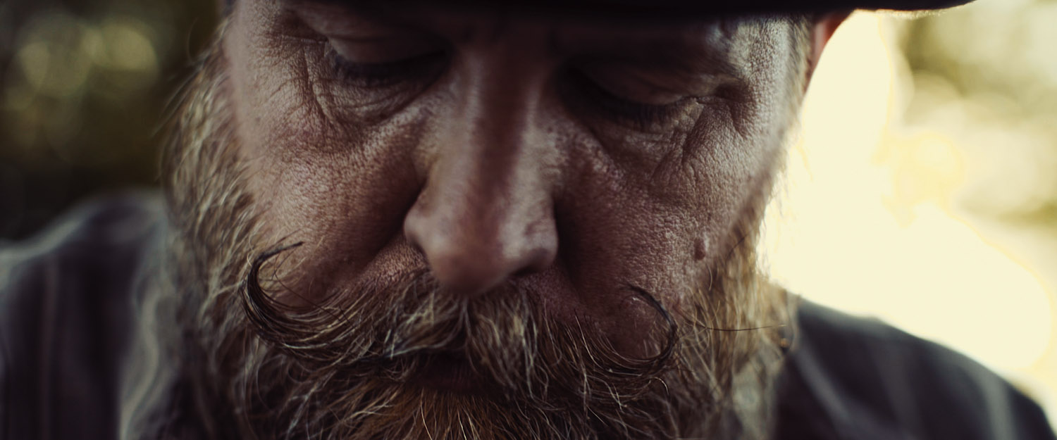
Lighting motivation: I wanted him back lit by the setting sun. He had white paper on his lap to act as a fill.
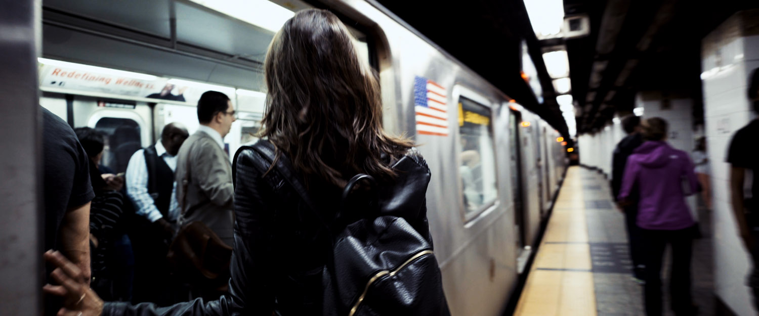
Lighting motivation: I wanted the artificial lighting to seemingly go on forever. No escape. In post, I pulled the curve way down. This is a dark story.
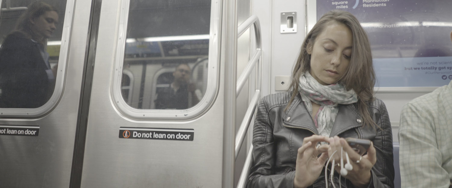
Lighting motivation: I wanted contrasting light sources to aid in the complex story. Tungsten vs. Daylight.
Lighting motivation: I positioned her so the sun was falling down on her face and slightly from the side. I knew that would compliment her features. So many mid tones in this image. This was the hero shot. Nice bell-curve shape for this.
Lighting motivation: Landscapes always look better in the golden hour, this lighting will show off the textures and details.
Lighting motivation: I wanted the lighting to look as uninviting as possible. Pull the curve way down in post. Add blue.


